Smarter Warehouse Yard Management solutions for Logistics

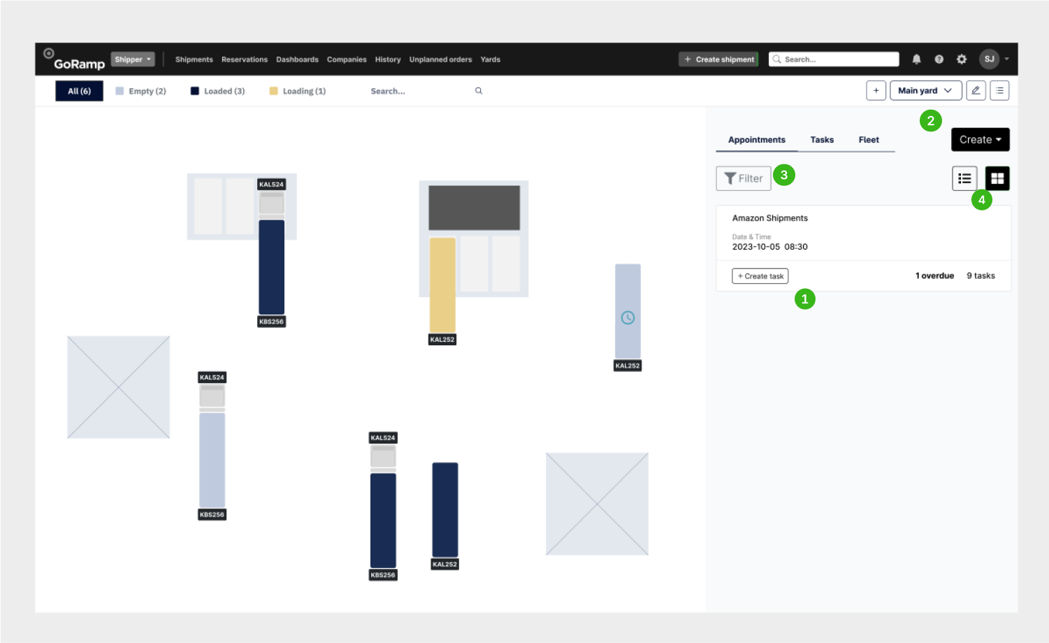
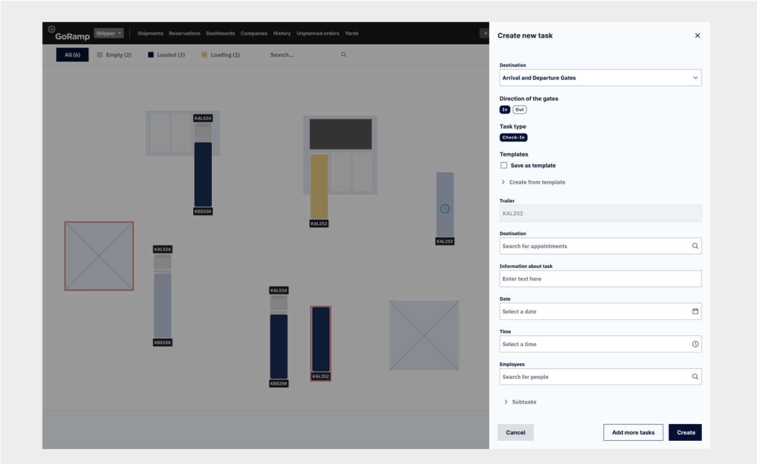
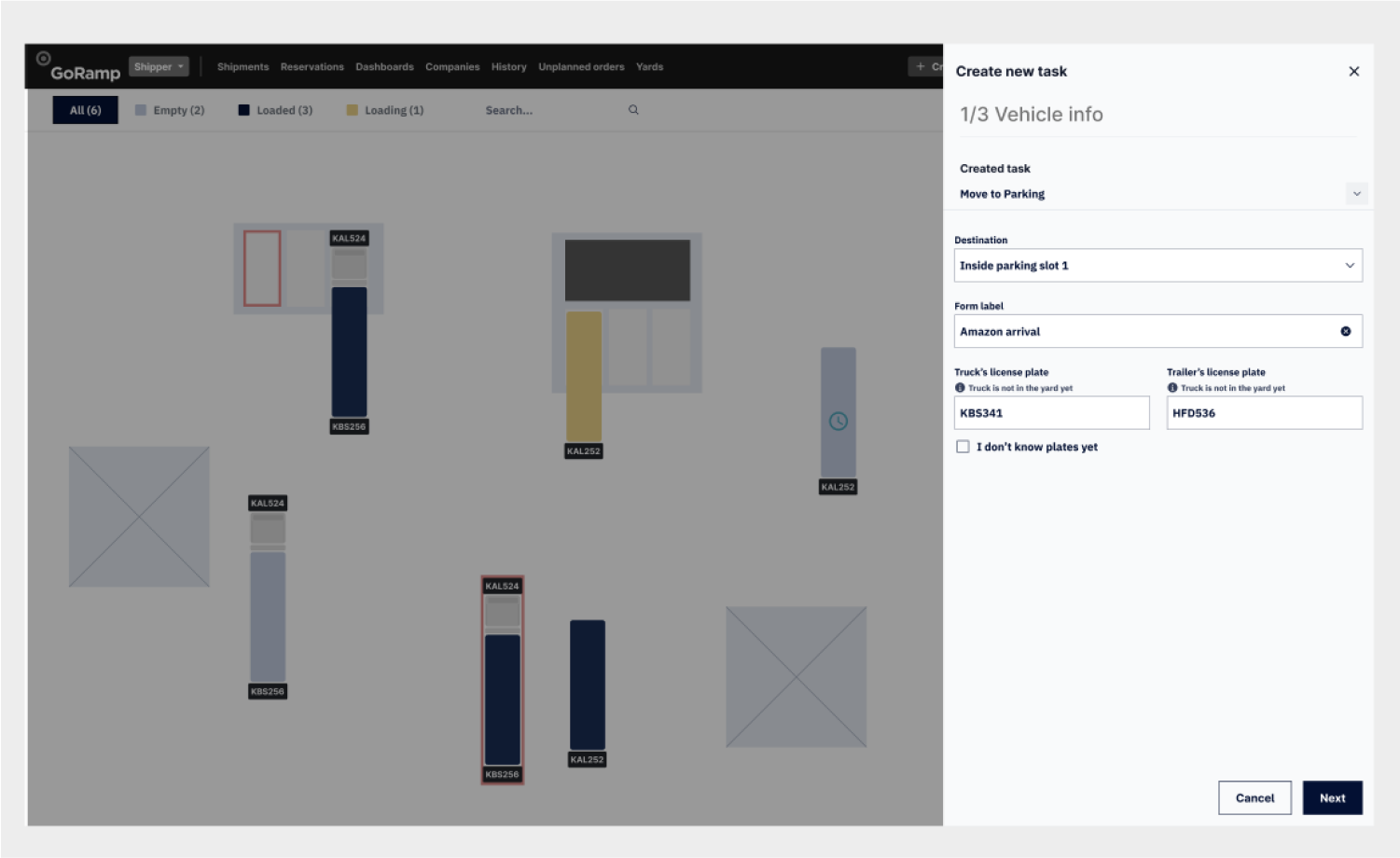
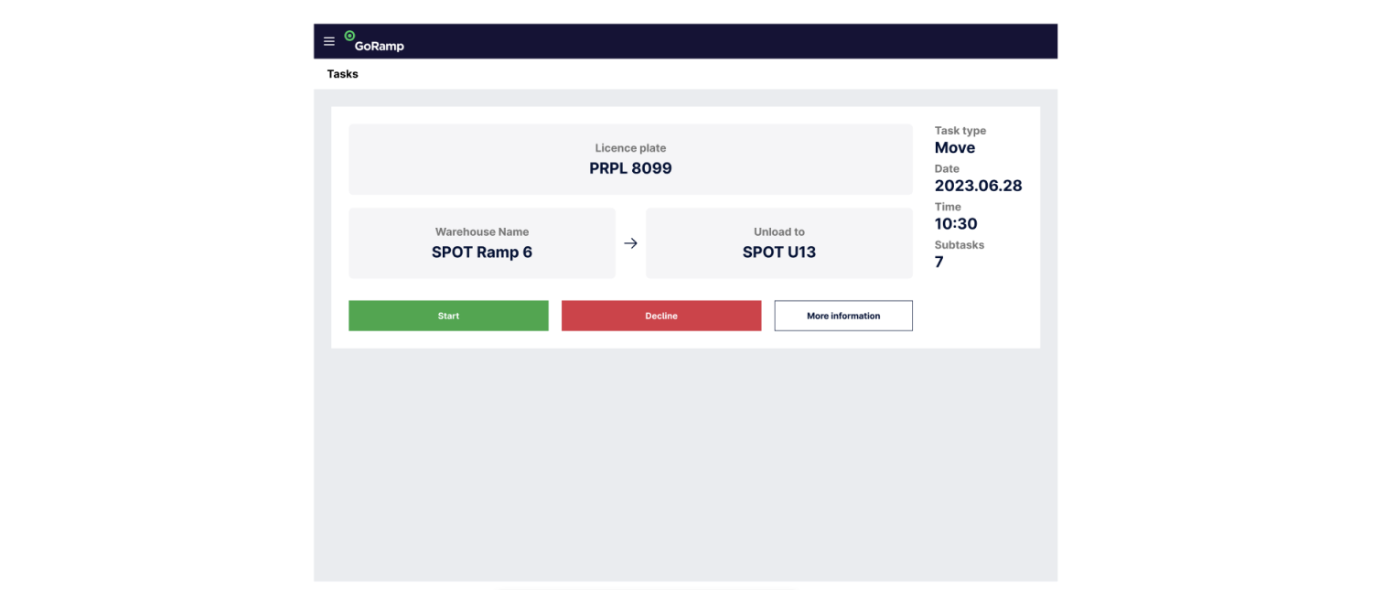
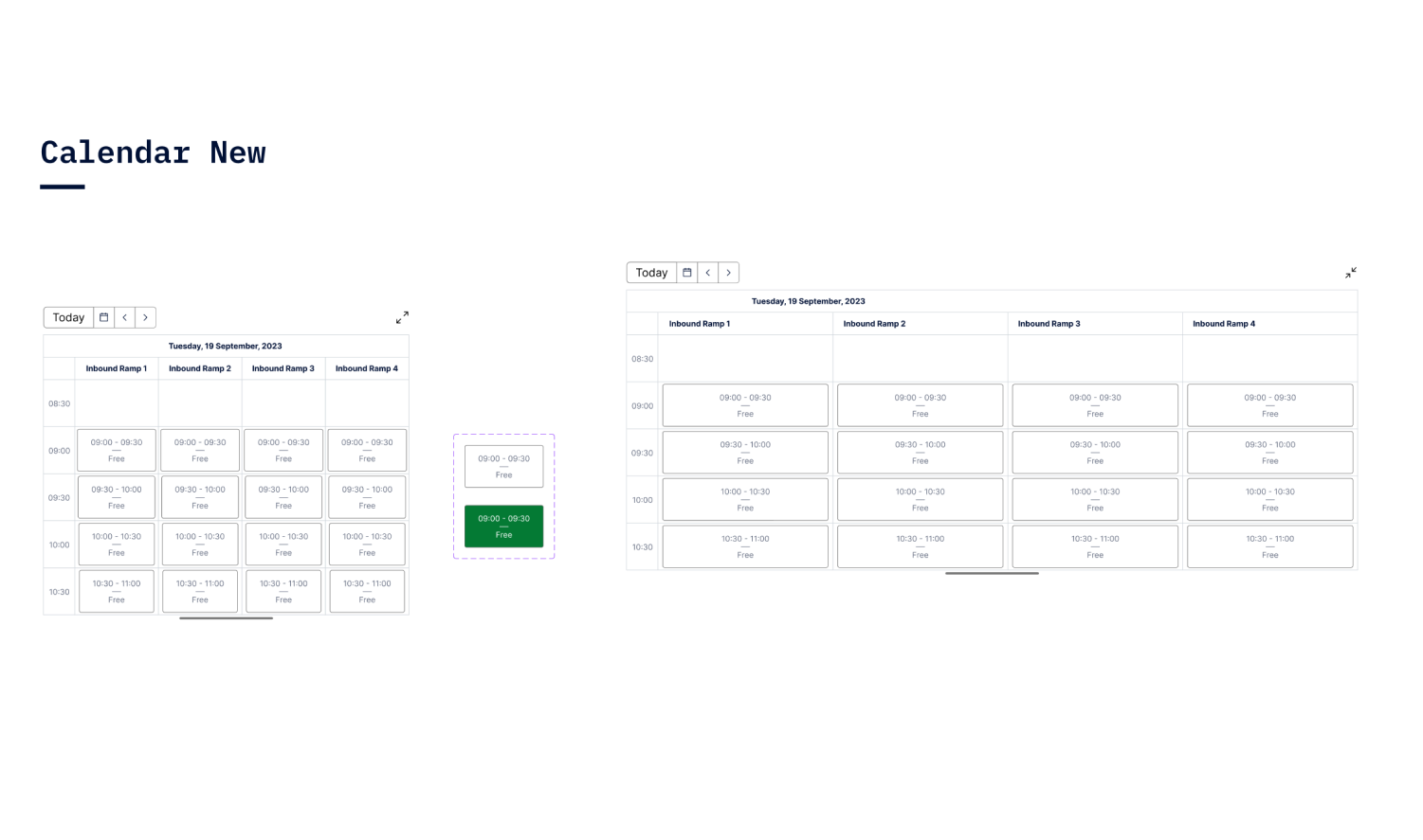
As a senior UX designer at GoRamp, I recently worked on a project aimed at tackling significant inefficiencies in warehouse logistics, specifically focusing on truck lineups at warehouse gates, unloading docks, manual yard activity backlogs, truck idle time, and manual processes that led to fines for delayed operations.

The main goal of this project was to streamline these activities and significantly reduce costs and delays.

This consists of only UX work.

My Role

Senior UX Designer

Company

GoRamp

Team

Designer (Me), Product Owner, Head of Product, Full Stack Developer.

GoRamp Web Interface

TLDR

  • How to understand complex logics.
  • Why low fidelity was solution to go.
  • Mobile view challenges.
  • Hand off.
  • Results.

My Role

I took on the role of designing user flows, creating prototypes, and collaborating closely with our Product Manager. My responsibilities were primarily centred on designing new features that addressed complex requirements, while ensuring a cohesive integration into our existing product ecosystem.

My role also included overcoming challenges in understanding logistics logic and ensuring my designs aligned with existing visual standards.

The work was for one product part.

Collaboration

The primary stakeholder for this project was the Product Manager, who served as the main point of contact. Collaboration was smooth and effective, with frequent exchanges to keep the project aligned with user needs and product goals.

The Product Manager played a pivotal role in providing user insights based on webinars with potential customers, which informed the iterative changes in my designs.

Instead of having meetings, sometimes we used “Loom” recordings to each other, which saved a lot of time.

Target Audience

We knew the target audiences for this project. But we used “Jobs to be done” approach. And also listed out tasks which are essential for them in their everyday life. This approach works better, as we plan operations and jobs they have to do, to make it easier for them.

At first we drew assumptions about what they have to do. With confirmation later on from the research.

Target Audience

Simple sticky notes approach in the Figma was the best to communicate and work directly on adjusting who we are designing for.

Challenges

1

Understanding the complex logistics logic

The logics, operations, business model. This took some time to be on the same level. A lot of mind maps, flow creations helped to achieve that. Usually my process for understanding is mind map creation.

2

Ensure no new components duplicated

Since this is just a one feature among many other products, I don’t want necessary to create duplicates of what is existing. Inspection among everything else, learning what is developed.

3

Consistent with the broader product line

I can not start creating new visual language if it is already existing. This would feel odd for customers, if they are using one feature, and another one is much more prettier. I did maintain visual style with re-design planned.

4

Balancing innovation with consistency

when creating new features that required a fresh approach but had to align with the existing ecosystem. Think of “Sims” when you drag and drop stuff around. This was the idea behind warehouse management.

Understanding Logics

Throughout the project, to understand the journey, the flows we have to do. We used user flows for each feature, before doing any wireframes or design work. This approach helped us to understand logic, areas of improvement and how to make easier for people to complete their task.

Understanding Logics

Planning with Low Fidelity

Most of the work went into Wireframes stage. Since developers already had components in their front end from last projects, I could do wireframes and they implemented with their own. This approach was faster to launch, since time was sensitive. Also working on new kind of product from scratch, wireframes solution seems more efficient. UI work was planned sometime in the future.

Main Yard Homepage

Main Yard Homepage
1

Sidebar

We needed to show all relevant information so user can make decision fast. Some horizontal scrolling appeared. So we questioned how impactful it can be.

2

Quick action buttons

Quick action buttons visible immediately. Creating new fleet, task or appointment should be fast. The placement seemed reasonable as it is related to the table.

3

Yard View

By drag and drop you can create tasks. Tasks are taken by people in the yard. Status of trucks, placement, plates were important to address.

4

Yard Filters

When yard gets really busy, the filters are needed to filter the yard, so you can check only relevant trucks, trailers. This was proven to be used be majority of users.

Yard iteration after feedback

Yard iteration after feedback
1

Card View

Instead of table view, card approach was suggested. That way we can display all information needed, no scrolling.

2

New Buttons logic

Since tasks are created from appointments mostly and from fleets. The button with dropdown seemed more logical.

3

Filters

When appointments, tasks gets crowded the filter introduction is needed. So users can filter only what is needed at moment.

4

View Options

However some people still wanted table for more information, the switch was kept. A lot of testing regarding icons usage was performed.

How to create tasks and subtasks

Creating tasks and subtasks takes a lot of information and is challenging. User has to see connections on the map for what creation is being made.

It looks long, since new requirements came over and this became monstrosity. After that I tried step counters, doing multiple steps and even chat approach.

How to create tasks and subtasks

Improved tasks after feedback and iterations

After experimentation this still has proven to be fastest way to add information on desktop. In terms of efficiency, the solution we didn’t wanted the most proven to be most efficient for warehouse managers.

To ensure everything is correct, there is also a summary of the task at the end before creating.

Improved tasks after feedback and iterations

View from the yard workers perspective

Workers in the yard are using tablets and sometimes phones to manage arrivals, on loading and offloading of the cargo. The solution had to be as simple as possible to analyse given information make decision in the moments notice.

Yard worker 1
Yard worker 2

Development

In terms of development and consistency, improvements were suggested gradually in separate stages. Requirement was to keep it simple, as for this type of business user, interface has to be clean without “fireworks”.

However it was not sure when suggestions were supposed to be implemented, since it is built on Bootstrap and there was ongoing more important work at at a time for developers.

Design

The challenge - how this would be implemented in mobile view?

To make this view on mobile - was challenging. A lot of data, map, various filters. We wanted to give opportunity to have operations managed at some point in mobile also. Mostly it is done in web view, but people want to have this on the go also.

Mobile View Yard
1

Modes

On mobile it is separated in two modes. It was a question how to name the first tab, but it was decided that this is “Management”

2

Actions

People on mobile can create new tasks, appointments. But they do it rarely on phones. So it was decided to leave on top.

Audits

In order to keep track of components with development and new upcoming changes. I did audits of existing system, plus how my designs were implemented. This helped to communicate and be on the same page with everyone. To ensure implementation is good.

Developers are busy with their own ongoing tasks and forget previous implementations. After these audits with POs were added to roadmap to match with wireframes.

Development

Usability Testing

User testing played a crucial role in shaping the final solution. Many changes to the project were directly based on user feedback gathered during testing sessions. Additionally, the Product Manager conducted webinars with potential customers, using my prototypes to present our ideas. The insights from these webinars were invaluable in refining our approach.

Also we used prototype analytics to see how fast they are going and which areas they take time to think. The only thing we could have done better here - test even more. This product needed extensive data and testing. The user base was specific.

Hand Off

For smooth components handoff I created “One source of truth”. Components library where developer can take a look, and if any updates are made they are reflected there. Comprehensive library helps to maintain consistency and have overview of all components being made at one place.

Handoff

Component Behaviour

For the styles, matching icons and re-usable components were created. In order to keep track of consistency. To ensure scalability of product line, I started by re-creating existing components from other areas of GoRamp and later on improved upon.

Design system documentation

Learnings

  • This project highlighted the value of B2B webinars as a powerful channel for gathering user feedback. Since we needed specific users in warehouse management operations.
  • introduced me to designing automatic solutions for logistics using a drag-and-drop interface to simplify the user experience.
  • Our target users often had low technical knowledge, so simplicity was paramount.
  • I learned the importance of considering multiple user roles—such as gate guards and loading dock workers—to create a comprehensive solution that worked for everyone involved in the logistics process.

Takeaways

25% reduction in transportation costs through streamlined operations.

40% reduction in driver waiting times in real-time.

70% reduction in manual operational work due to automation.