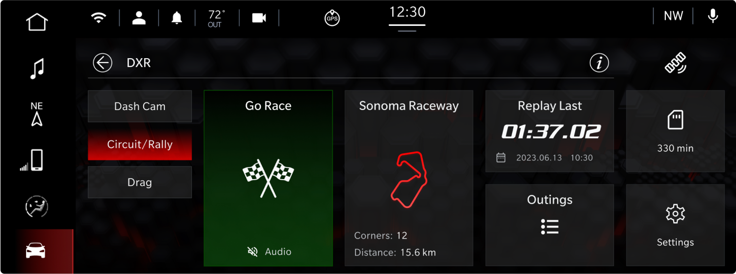
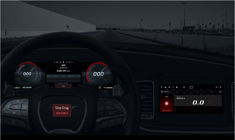
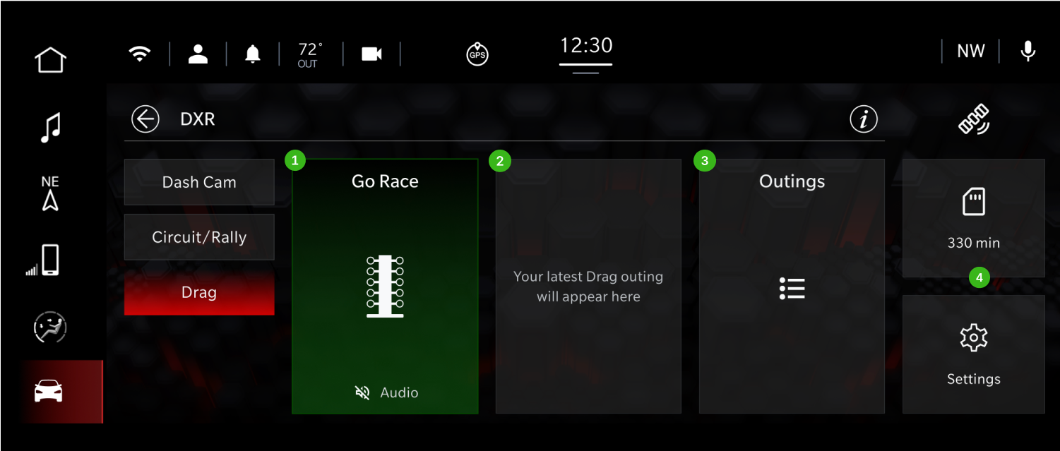
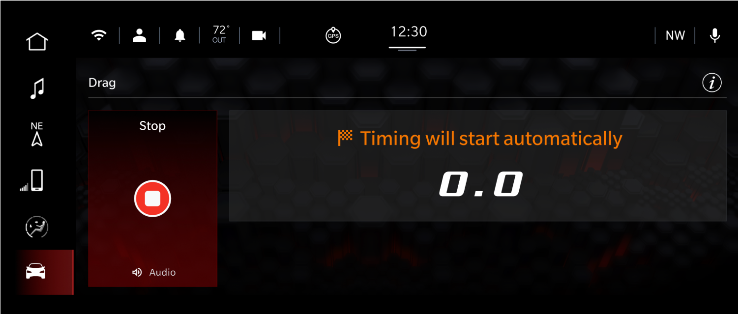
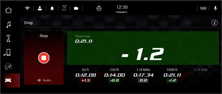
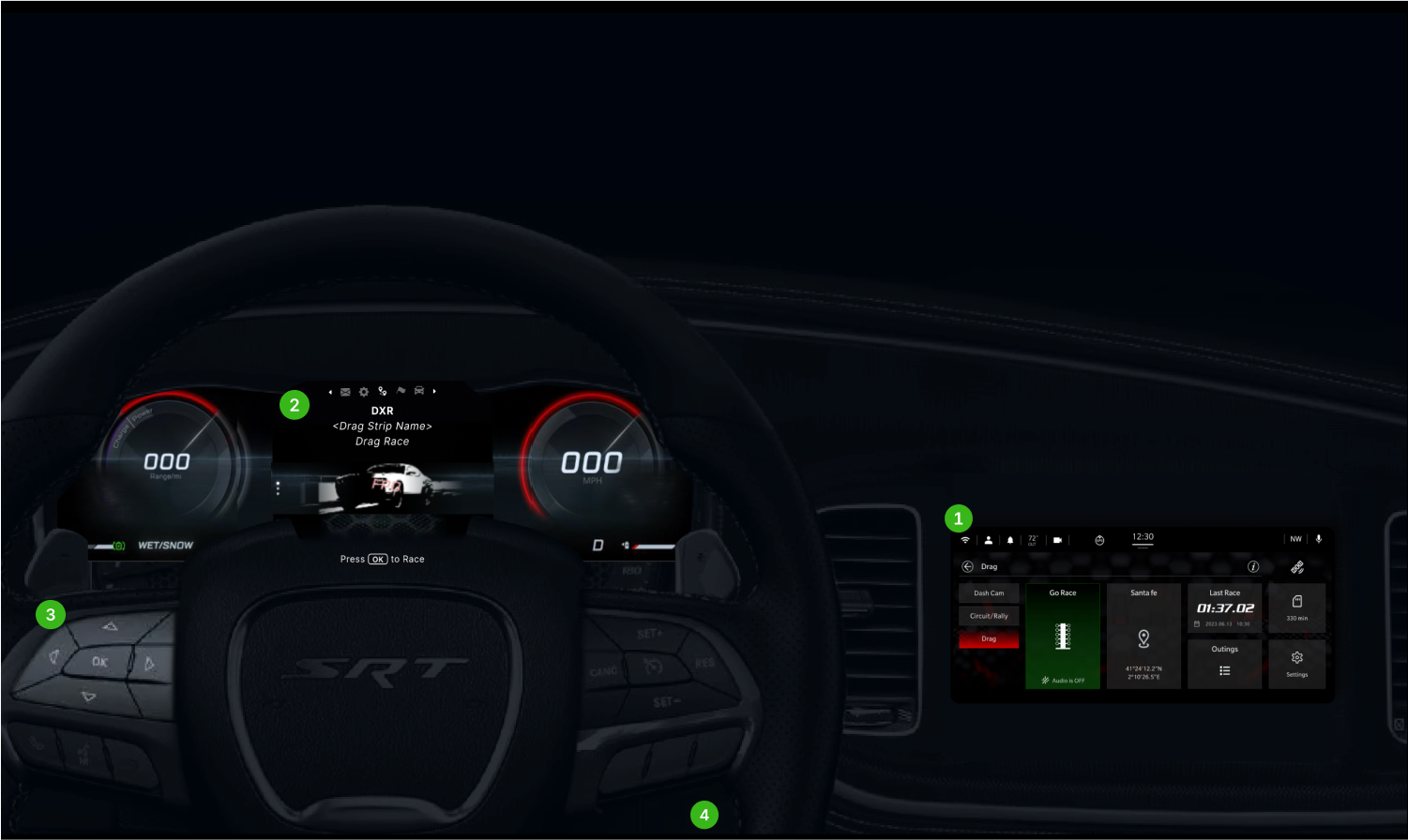
Transforming cars into a racing machine with performance metrics

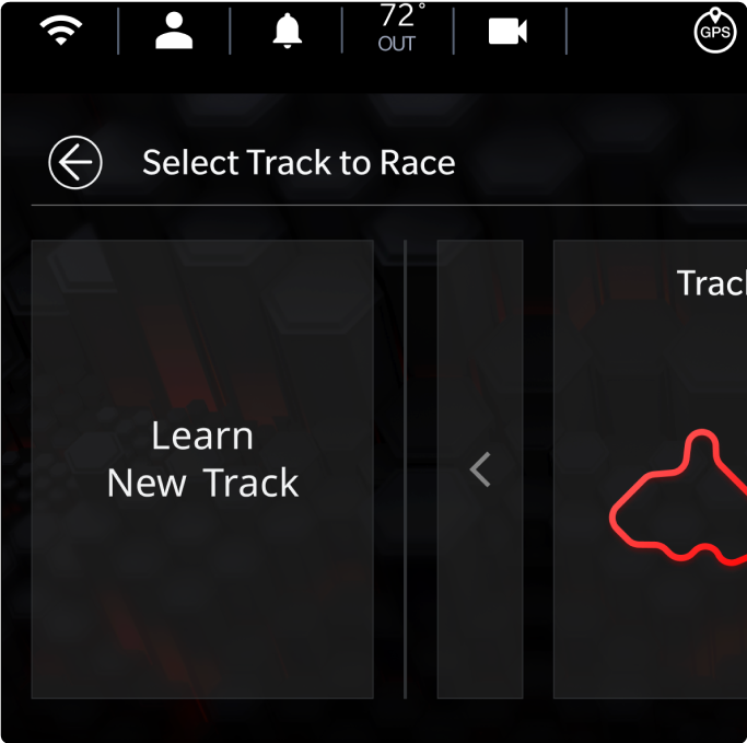
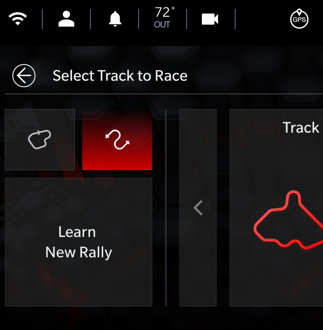
The goal - Give drivers the tools to race smarter. Live performance metrics for drag, circuit, and rally modes, synced across their dashboard and mobile devices.

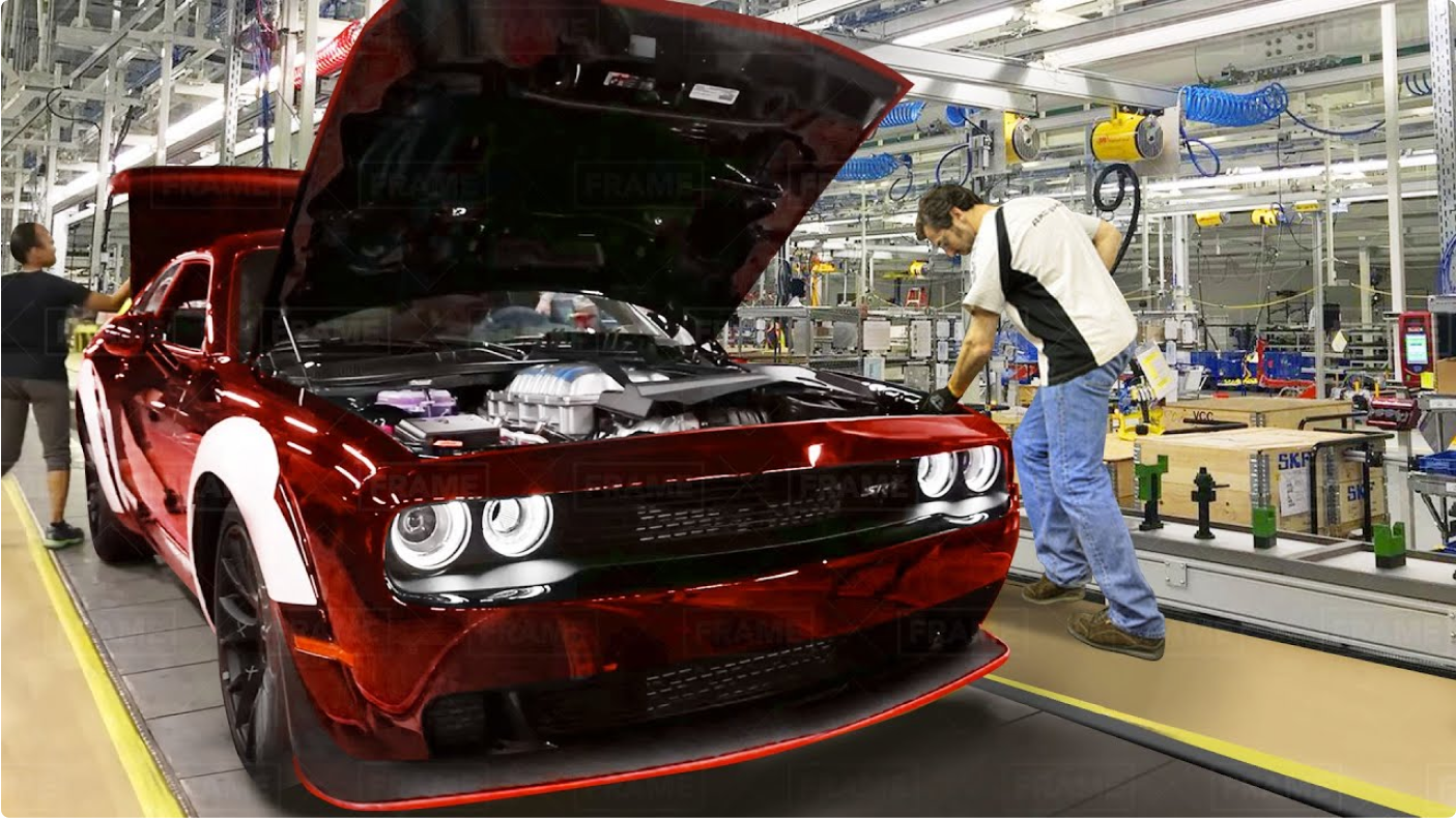
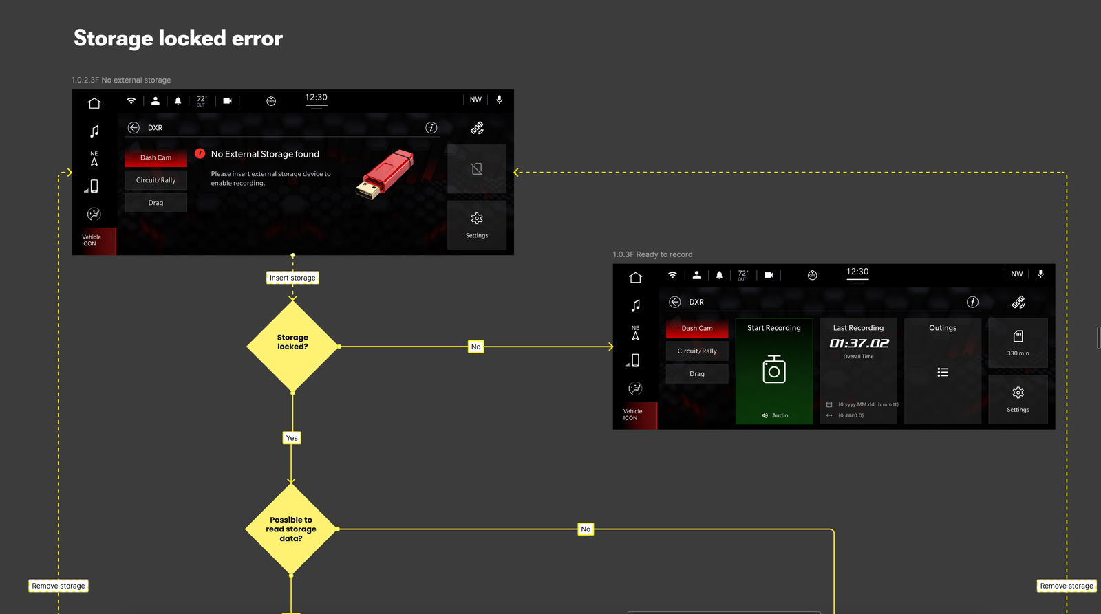
With features like speed tracking, in-car video recording, and exportable race clips, this app transforms the "Hellcat" into a personal racing machine — straight from the dealership.

My Role

Senior Product Designer

Company

Stellantis

Team

Designer (Me), Business Analyst, Front End, Back End, System Architects, QA, Product Manager, Stakeholders

Stellantis Racing App Interface

TLDR

  • Designed and launched a racing app tailored for Dodge Challenger Hellcat drivers.
  • Integrated the experience directly into the car’s infotainment system.
  • Focused on seamless drag racing functionality and intuitive user flow.
  • Collaborated closely with engineers, product managers, and automotive partners.
  • Delivered measurable impact and elevated the in-car racing experience.

Prototype

A driver-first prototype brought the experience to life — helping the team align on the vision and enabling effective usability testing.

My Role

I was responsible for turning the vision into a real, usable product — leading the app’s design, building and maintaining the design system, and working closely with engineers, architects, analysts, and stakeholders. I helped shape the roadmap, prioritized features, conducted user research, and ensured every design decision aligned with both business goals and technical realities.

Who we design for

Designed for two key personas: aspiring young racers and race school instructors. Based on research, the app targets occasional drivers who want more from their Dodge — turning everyday drives into a premium racing experience.

Target audience personas and research

Personas helped later on for the ideation of the features, how they want to share their racing experience with peers. Stakeholders were a bit lost at the beginning of the project, this helped to get more clarity also.

Design Principles

Before designing, we defined clear principles to guide decisions and align all stakeholders — helping avoid future conflicts and keeping the team focused.

1

Automatic

Minimal driver input. The app anticipates actions and surfaces relevant info at the right time.

2

Informative

Delivers insights tailored to the driver’s experience level — helping them improve over time.

3

Fun

Racing should feel exciting — so the app uses slick animations and playful interactions to keep it engaging. .

Challenges we faced

1

Design & Documentation Sync

With a large team, staying aligned was key. I integrated live documentation into Figma, keeping designs and requirements connected — even for those learning Figma on the fly.

2

Hardware Constraints

We had just one shot a year to test the app on a real car before factory production. Some features had to wait for future releases due to tight technical limitations.

3

Surprise Translations

What started with three languages quickly expanded to include Arabic and Asian markets. Using JSON exports, we created a smooth localization workflow with developers.

4

Testing in the Wild

Testing in a moving car wasn’t an option. We recreated the experience on tablets and in browser-based prototypes during real racing days to gather feedback.

Challenge visualization with car interface

How everything started

Since this was a brand-new project, I began by diving into Android Auto guidelines and exploring design patterns from Alfa Romeo and older GM systems.

We started in black & white — sketching ideas, testing layouts, and figuring things out as we went. It felt messy at first, but the structure slowly emerged as we explored what could work.

Like any complex project, it is a good thing to work on logics, flows and understand principles of how it should work in between.

Ideation process and sketches

Gaming as Inspiration

To shape features like track selection and sector breakdowns, I looked beyond traditional UX — turning to racing games like Gran Turismo and Need for Speed. They offered great insights into how to make performance data feel exciting and intuitive.

Ideation process and sketches

Feature Roadmap

When everything felt urgent, I facilitated workshops to align priorities and build a clear roadmap. This visual became our north star — helping the team stay focused, communicate progress, and make informed trade-offs.

Project roadmap visualization

Quarterly roadmap created in collaboration with cross-functional teams

Designs and Journey

Before designing, I immersed myself in the world of drag racing — watching videos, reading forums, and even attending a live race. Talking to drivers gave me insights into how they use data in real time.

Interface design

To bridge the system with the real world, I used familiar racing elements. For example, the race start icon was inspired by the actual drag racing “Christmas tree” light — something every racer instantly recognizes.

Interface design for drag racing
1

'Go Race'

Launches drag mode instantly. Testing showed that audio recording needed to be optional.

2

Empty states

First-time users see a placeholder explaining where data will appear.

3

Outings

This section lets drivers review their recorded tracks and performance data.

4

Options

The line above indicates that the app functions goes only as far as Outings.

Pre-Record & Staging

Before recording starts, drivers enter the Staging area — where they prep tires and line up. At this point, the Delta Timer sits at 0.0, acting as a neutral baseline. During races, it compares your performance to the previous run, showing if you're gaining or losing time in real-time.

Pre-record interface

Starting a drag race

In line with our “automatic” principle, there’s no manual start button. The system detects full-throttle acceleration and begins timing automatically using G-force sensors — no taps needed, just drive.

Starting drag race interface

Race in progress

The race ends automatically based on track length. Drivers can also manually stop it — either by hitting the brakes or pressing the stop button.

Race in progress interface

Infotainment Ecosystem

Designing the app meant thinking beyond the screen — considering how drivers use steering wheel controls, dashboard displays, and car widgets. Most interactions happen through the wheel while driving; the app itself is meant to be used when the car is stationary.

Infotainment ecosystem overview
1

Car computer

The Android Auto App by functioning as the car app.

2

Dashboard

Some of the actions are shown in the display while driving. Like start, stop, stats.

3

Wheel Controls

Like every other app in the infotainment system driver controls via arrows and "OK".

4

Pedal controls

Other non obvious controls are done by acceleration or brakes.

Usability Testing

Testing without a real car was tricky — so I built interactive prototypes to simulate the in-car experience. We focused on drag mode and track selection, leading to key updates like smarter location-based track logic.

One insight: users wanted to save races from unofficial tracks. We supported it with a simple label — "Unnamed Road" — balancing user freedom with ethical design.

Interface before usability testing

Before

  • Track type was selected deep within the flow, with all race modes grouped together — drag, circuit, and rally.
Interface after usability testing

After

  • Race type is now selected upfront. Drag racing was separated due to its unique logic and flow, making the experience more intuitive from the start.

Design Decision: Drag Racing on Public Roads?

Legally, racing should only happen on official tracks — but user research showed many drivers wanted to record spontaneous races on empty roads.

The compromise: We allow recording and saving race data, but not the location. These sessions are stored under "Unnamed Location", giving users flexibility without promoting unsafe or illegal behavior.

Design Handoff

To streamline collaboration, I used wireflows to show all user paths and edge cases — complete with arrows, documentation, and prototype videos. This clear, self-serve format kept developers and stakeholders aligned, reduced meetings, and ensured smooth handoff.

Design handoff documentation

Design System

To keep the experience consistent and on-brand, I followed Stellantis’ UI guidelines and dug deep into Android Auto best practices.

The result: an app that feels native to Dodge — cohesive, intuitive, and distinctly branded. Components were clearly organized and documented for the dev team, making implementation smooth and aligned.

Design system documentation

Learnings

I learned the power of borrowing from unexpected places — like racing games — to create a more immersive automotive experience.

Deep collaboration with engineers and understanding Google’s automotive patterns were key. When technical constraints hit, adaptability and creative problem-solving made all the difference.

Takeaways

The app was implemented in 2025 Dodge Challenger Hellcat models, marking a major milestone for the team.

While some features were postponed, we shipped a solid first release by adapting to technical challenges without compromising core value.

Well-documented guidelines and assets enabled the in-house dev team to build faster with fewer blockers.

The design system was built with flexibility in mind — allowing future updates without disrupting the user experience.